Client
B&Q
Project dates
Oct 16 – July 17
Platform
Responsive website
Problem statement
Home Improvement journeys are often long and complex. There is a huge choice of products requiring different skills and knowledge to install.
Objectives
Develop services that help make home improvement easier and more enjoyable for more people than ever before. That increases the chances of starting and completing a DIY project successfully.
My role
Service Design Lead for a team of 3 UX and 3 UI Designers. I provided focus and support for my design team for their ideas to grow whilst ensuring we were delivering product features the aligned with user research insights and business goals.
Process
Some great primary research was conducted; shadowing customers in their homes during real DIY projects. This helped us identify common problems and needs.
- Getting started – DIY projects are full of unknowns and everyone needs a source of confidence (tradesmen, YouTube, friend or family member)
- Flexibility in approach – Customers don’t always feel prepared to start, and can find it hard to adjust to changing circumstances and deal with the unexpected challenges that occur along the way
- Flexibility in standards – Expectations and final outcomes can change along the way. Home improvement isn’t necessarily about aiming for perfection or following rules.
- Encountering adversity – Customers need to be supported when dealing with the unexpected, learning from mistakes or due to loss of momentum.
We discovered that when it comes to improving your home, it can be a world of pleasure and pain. This informed the creation of experience and empathy maps for different customer types.
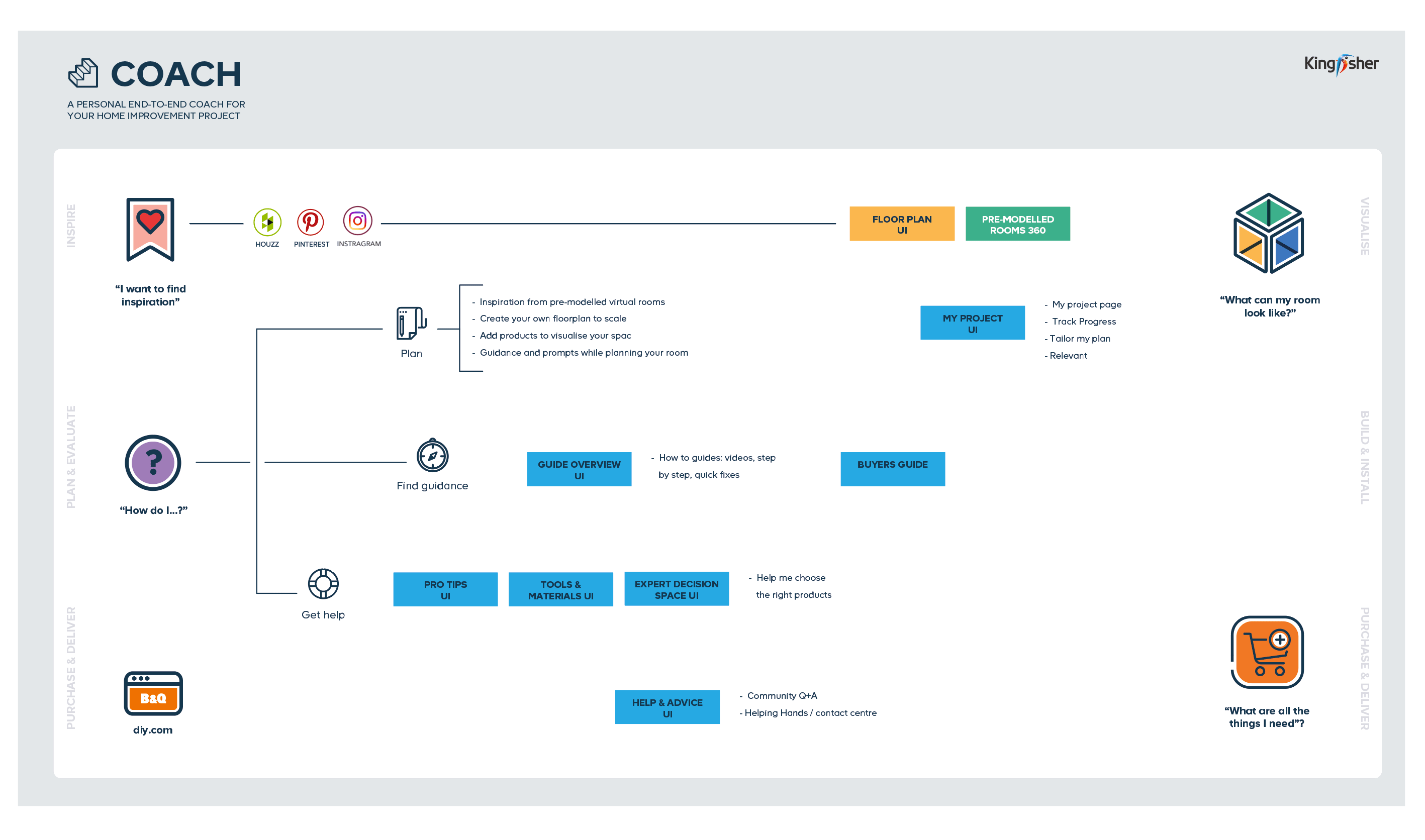
I translated the key pain points and insights into a high level service map – showing potential entry points and features. This set the strategic direction for the design team to generate concepts.
Value proposition
How might we… inspire customers to start new projects
How might we…guide customers to becoming better home improvers
How might we… provide tailored support to get the job done
Designs
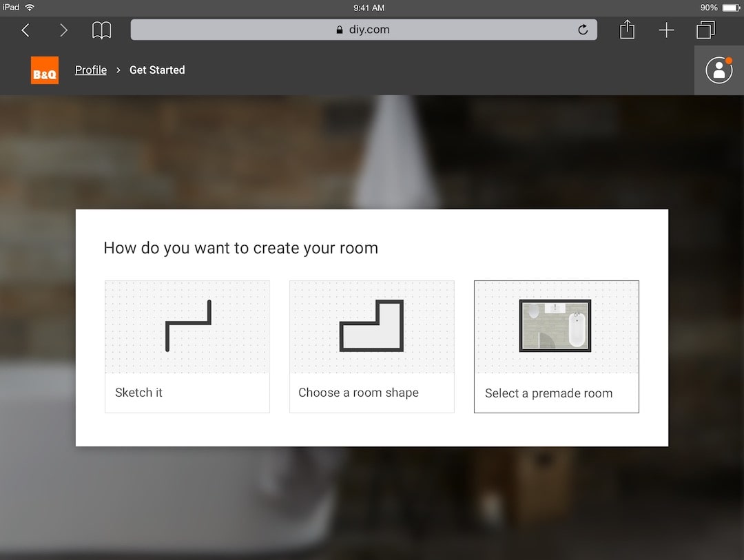
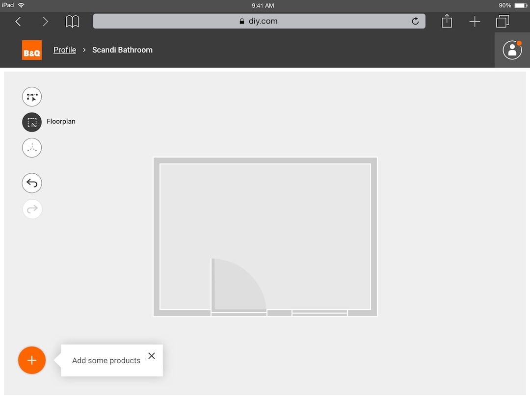
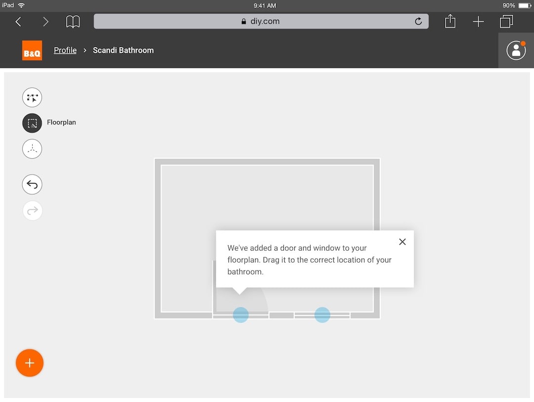
We created concepts as low fidelity wireframes – which we evaluated to achieve specific goals and KPI’s. After iterating and improving the designs, we built high fidelity proto.io prototypes for user testing. After validating designs, we worked in 2 week sprints, handing off validated designs to a dev team.
Testing and refining
Through regular user testing with an interactive prototype we measured:
- Engagement with content and features.
- Percentage of users saving or creating a project.
- Percentage of users who would use the service for their own home improvement project.
Through interviews and surveys we learned:
- Whether the tool gives novices more confidence to start and complete a project.
- Whether the tool encourages customers to start other home improvement projects
Results
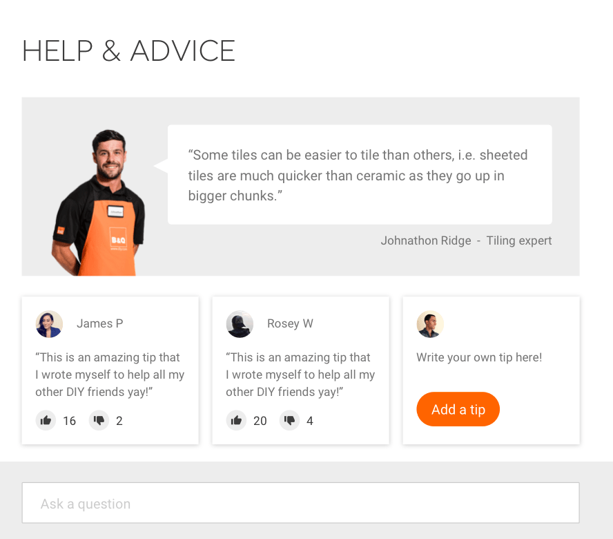
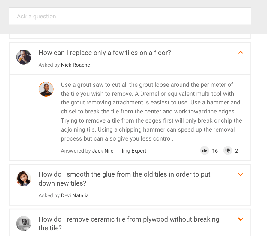
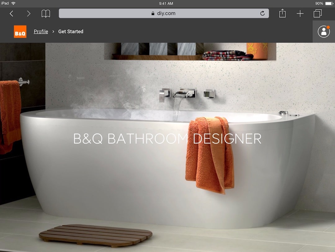
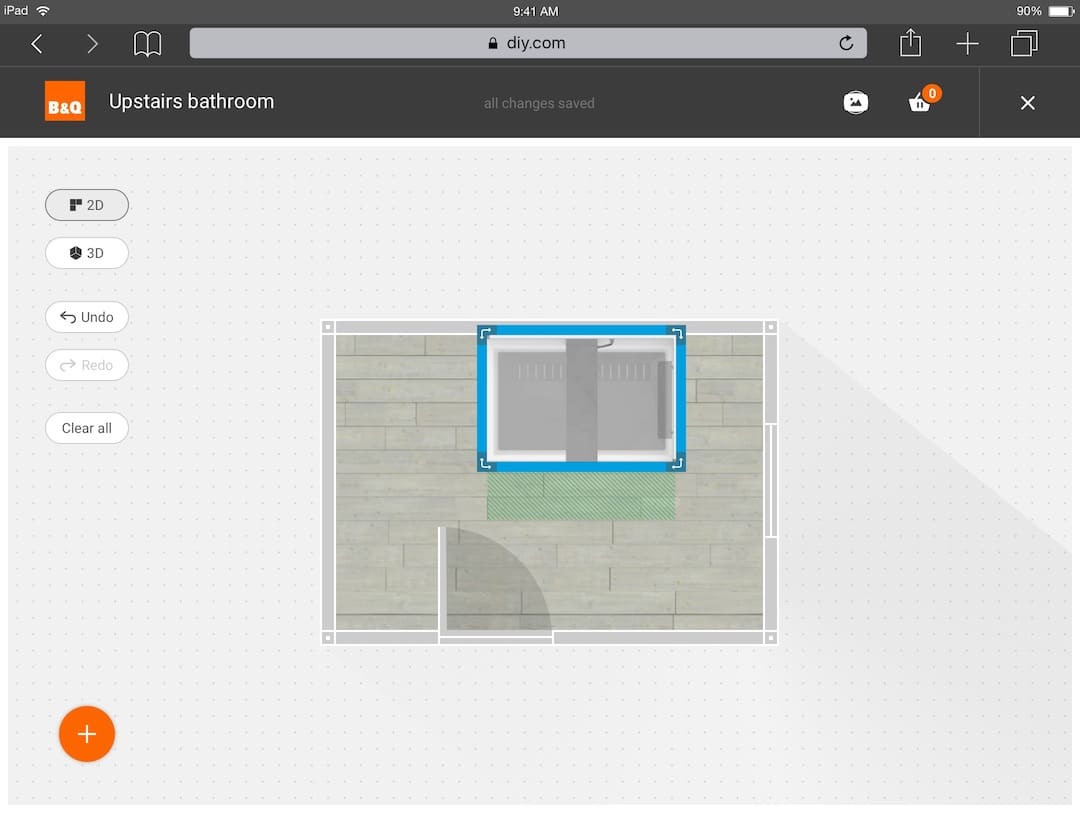
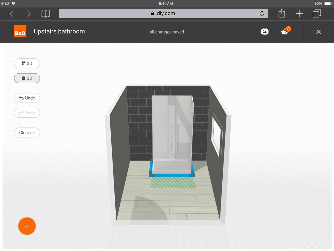
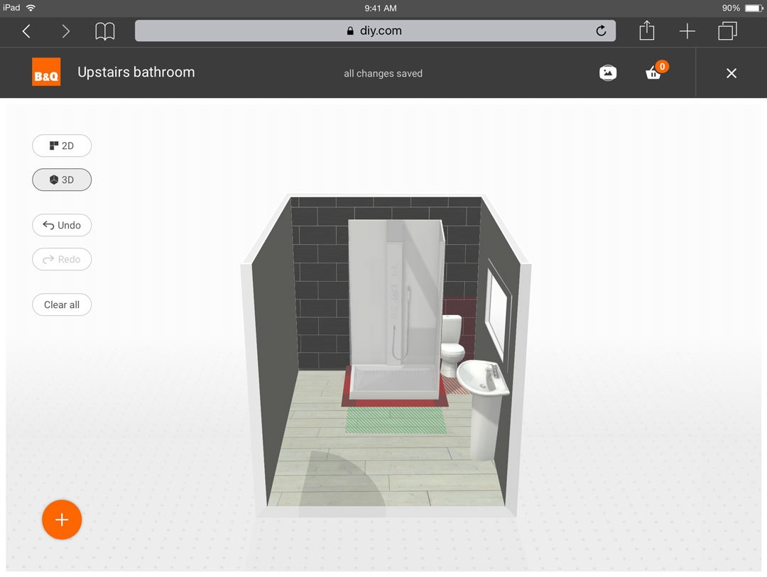
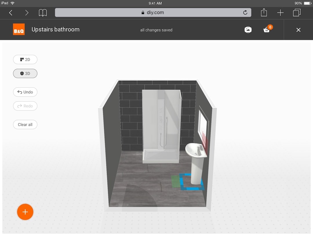
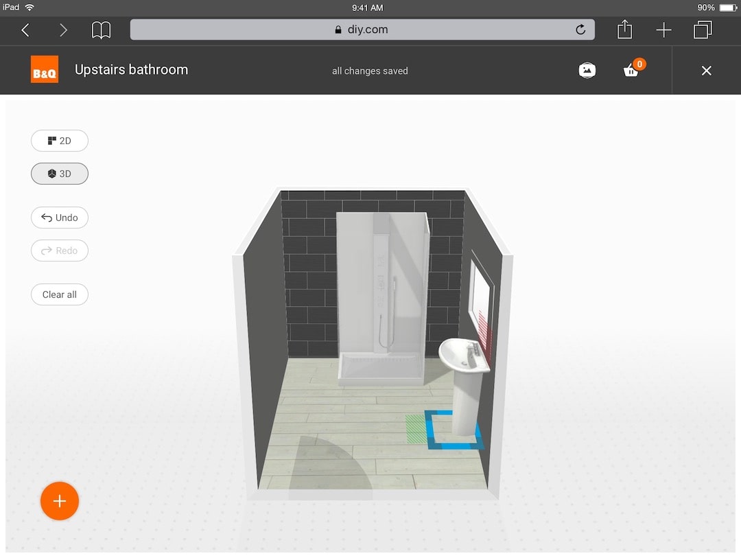
We created a service for customers to design and plan their bathroom renovation based on the products and materials in their 3D visualisation. We also used this to collate relevant how-to guides, videos, hints, tips and buyers guides to complete their project.


